• Portfolio
  • Artist's Statement
  • Bio / CV
  • Press
  • Blog
  • Events
  • Contact
Menu

Molly Block

  • Portfolio
  • Artist's Statement
  • Bio / CV
  • Press
  • Blog
  • Events
  • Contact
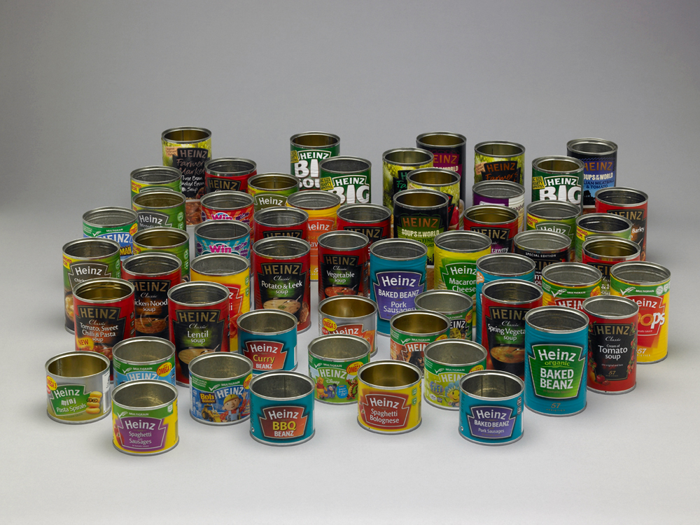
Everything Heinz : Daniel Eatock

Everything Heinz : Daniel Eatock

April 1, 2013
Source: http://eatock.com/projects/everything-hein...
Tags repurposed, food, art, sculpture, packaging, Heinz, Daniel Eatock, design, today's spot o' color
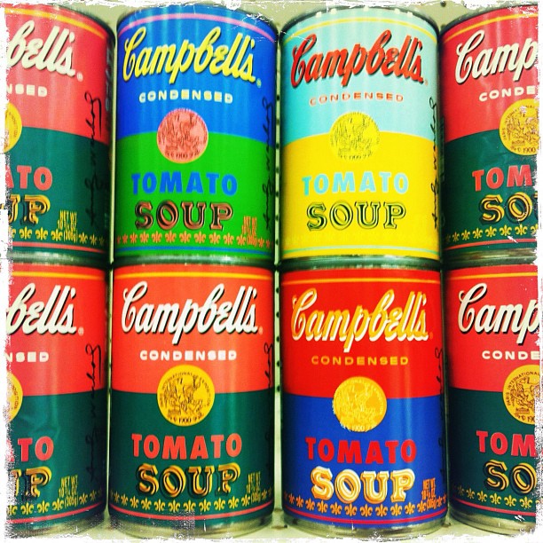
Today: Cans filled with Campbell’s tomato soup.
Next month: After the soup’s consumed, the empty cans, with colorful labels still on them, will be repurposed as … art supply holders!
[If you haven’t heard about these special…

Today: Cans filled with Campbell’s tomato soup.

Next month: After the soup’s consumed, the empty cans, with colorful labels still on them, will be repurposed as … art supply holders!

[If you haven’t heard about these specially designed labels, here’s a little info: Campbell Soup Co., in a promotion with Target stores and The Andy Warhol Foundation, packaged a batch of tomato soup in cans covered with limited-edition Andy Warhol-inspired Pop-art labels. The cans were made available this past weekend at Target store. (I read that some stores sold out hours after the cans went on sale.) The project commemorates the 50th anniversary of Warhol’s famed Campbell’s soup can work. A portion of revenue from the project will benefit the Warhol Foundation.] Now I have to admit that I don’t typically shop at Target, but I needed cat litter, and I’d read about the can promo; together, they gave me a reason to visit a nearby Target store! #Popartisforeveryone

(Taken with Instagram at Super Target)

September 5, 2012
Tags popartisforeveryone, Warhol, Andy Warhol, Campbell's Soup, packaging, repurpose, repurposed, soup cans, amusing, today's spot o' color
Andy Warhol, Yellow Brillo Box, 1964; White Brillo Box, 1964; Mott’s Apple Juice Box, 1964; Heinz Tomato Ketchup Box, 1964; Del Monte Peach Halves Box, 1964; Campbell’s Tomato Juice Box, 1964; Kellogg’s Corn Flakes Box, 1964.
Plywood boxes, painted …

Andy Warhol, Yellow Brillo Box, 1964; White Brillo Box, 1964; Mott’s Apple Juice Box, 1964; Heinz Tomato Ketchup Box, 1964; Del Monte Peach Halves Box, 1964; Campbell’s Tomato Juice Box, 1964; Kellogg’s Corn Flakes Box, 1964.

Plywood boxes, painted and silk-screened with consumer product logos.

(via Walker Art Center)

March 20, 2012
Source: http://www.walkerart.org/calendar/2010/196...
Tags art, Andy Warhol, 1960s, 1964, Mad Men era, Pop Art, consumerism, packaging
Via szymon:

All you can get by Ryan Yoon for Virgine Magazine

Via szymon:

All you can get by Ryan Yoon for Virgine Magazine

August 2, 2011
Tags packaging, visuals, Tide, today's spot o' color

June 23, 2011

Via unconsumption:

Texas to get the first packaging-free grocery store in the U.S.

In.gredients, which is slated to open this fall in Austin, will sell loose and bulk items, including “local, organic meats, dairy, baking goods, cooking oils, spices, grains, seasonal produce — the whole spectrum.” Customers will need to bring reusable containers from home (or use the store’s compostable containers), and weigh them before filling with the products they want. 

In.gredients’ package-free, zero-waste retail concept, similar to that of Unpackaged in London, is a great business model. The benefits of precycling — avoiding wasteful packaging — and buying only the amounts you need of locally sourced products, creating less landfill and saving money in the process, are many. 

If you have friends in Austin, encourage them to support in.gredients. And let’s hope in.gredients will expand to other markets. [Hi, Houston next, please.]

No matter where you live, check it out: You can follow the company’s progress here (blog and Web site), here (Facebook), and here (Twitter).
Source: http://in.gredients.com/
Tags packaging, package-free, waste, waste-free, packaging-free, food, news, Austin, Texas
Procter & Gamble Co., General Mills Inc., Hostess Brands Inc. and PepsiCo Inc. are pulling old package designs out of their archives for brands like Tide, Cheerios and Doritos and bringing them back to store shelves. Smaller companies and start…

Procter & Gamble Co., General Mills Inc., Hostess Brands Inc. and PepsiCo Inc. are pulling old package designs out of their archives for brands like Tide, Cheerios and Doritos and bringing them back to store shelves. Smaller companies and start-ups are using fonts, colors or designs that evoke the past on their labels.

The move is a U-turn from labels cluttered with specific claims like “easy pour spout” or “better tasting” to packaging that plays on the emotions. Over time, labels have gotten busier because computers allowed for complex designs and marketers wanted products to stand out on crowded shelves.

“We got to the point where you couldn’t add one more bling thing to a package,” says Christine Mau, director of design at Kimberly-Clark Corp., the maker of Kleenex and Huggies, among other items.

The retro movement is driven, in part, by consumer-goods companies feeling pressure from retailers’ private-label products, which are generally less expensive. 

Manufacturers also say they are hoping to benefit from consumers’ generally sunny impression of the past and stand out in a sea of modern, glossy packages.

Full story: New! Improved! (and Very Old) - WSJ.com

May 26, 2011
Source: http://online.wsj.com/article/SB1000142405...
Tags retro, new, packaging, product, design, branding, today's spot o' color
Via unconsumption:


It’s an idea that sounds … well, bananas.
Del Monte has come up with individual plastic packaging for bananas, a fruit that already comes in its own natural, biodegradable wrapper.
Paradoxically, Del Monte says the packaged ba…

Via unconsumption:

It’s an idea that sounds … well, bananas.

Del Monte has come up with individual plastic packaging for bananas, a fruit that already comes in its own natural, biodegradable wrapper.

Paradoxically, Del Monte says the packaged bananas, which will be marketed [in a trial] as a “natural energy snack on the go” in Britain and the United States, are intended as a green initiative.

The clear pouches are said to contain “controlled ripening technology,” purported to extend the shelf-life of the fruit by several days. 

Del Monte’s U.K. managing director James Harvey [told the Fresh Produce Journal] … “Del Monte’s new CRT packaging is designed to provide significant carbon footprint savings by reducing the frequency of deliveries and the amount of waste going to landfill. The packaging is also recyclable.”

Can extra packaging really be more environmentally friendly?

(Story via The Globe and Mail; photo via The Daily Mail Online.)

(hat tip to our friends at Green Thing, @Dothegreenthing)

Related: Earlier Unconsumption post about banana stickers.

March 3, 2011
Source: http://unconsumption.tumblr.com/post/36226...
Tags food, packaging, why?
Older Posts →

View a favorite vintage sign photo series:

Texas Vintage Neon Signs
92 dpi screen Texas Neon Now Gone.jpg
92 dpi screen Texas Favorite Study 2.jpg
92 dpi screen Oak Forest Shoe Shop.jpg
92 dpi screen Cafe Neon Sign 4.jpg
Holiday Plaza Motel 148  n 92 dpi.JPG
Landmark Lodge 52 n 92 dpi.JPG
92 dpi screen Landmark in Fort Worth.jpg
Clock Coffee Shop in El Paso 92 dpi.JPG

© 2025 Molly Block.
   All rights reserved.